For reasons too tedious to explain here, I had to decide on a colour scheme for an upstairs bedroom in rather a hurry. I’d been
The room itself, as with most of the rooms in our 50s semi, needed stripping back to basics and starting again. Jobs included channelling down walls in order to bury electric cables (yes, mains ones – originally feeding through to double sockets on a removeable headboard), moving the ceiling pendant to the middle of the room from in front of the window, insulating the bay window (thoroughly recommended if you get the opportunity), repairing/replacing skirting board, plastering and adding a picture rail.
Everthing apart from the plastering was done by my brilliant dad (DIY brains) and equally brilliant husband, S (DIY brawn). We hired a plasterer for the walls, which needed it after our efforts to remove the woodchip, and to skim the artex ceiling (no plasterboard, he just skimmed straight over). He was brilliant although he’s semi-retired and kept refusing my help. I gave him lots of tea but it just didn’t seem enough.
When the room was prepped, we went out and bought several shades of grey. Which turned into five. Which turned into seven. Which turned into nine and a half.

The half comes from a paper swatch sample from Crown in Petit Palais Eglise Grey. Despite
So, here are my nine shades, minus the bit of paper, but with the added bonus of a smiley face in Crown’s City Break (“too dark”).
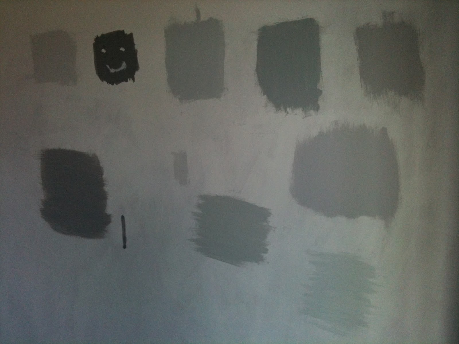
The other samples are:
- Dulux Polished Pebble
- Dulux Chic Shadow
- B&Q Colours Light Rain
- Wilko Mineral Stone
- Wilko Pearl Grey
- Homebase Dove Grey
- Homebase Silver Mist
- B&Q Cool Grey
I just couldn’t make my mind up. Too blue and the room would look cold, too pink and my teal wouldn’t work, too pale and it wouldn’t look ‘grey’ enough, too dark would feel dungeonlike. And, of course, every colour looked different depending on where in the room it was placed and what time of day it was. So I did what any sane person would do. I made S stand against each and every blob of paint (on all five bits of wall we painted patches on to) holding my small swatch of fabric up against it. For several weeks.
I don’t have a picture of him doing this, sadly, but I do have a picture of the fabric.

After much deliberation we narrowed down the choice to Polished Pebble and Chic Shadow, with Chic Shadow just coming out on top, for being “more grey” (I was pretty obsessed by this point). I have Polished Pebble in the bank for the hall, stairs and landing, but that’s another entry.
Next job is to put up the curtain rail, which comes with its own special set of challenges.
p.s. Not wishing to waste my painstakingly chosen sample pots, in the spirit of thriftiness I’m thinking of mixing one in with some of the white value emulsion used in the downstairs toilet in order to create something like a French grey.
2 comments:
"Small Palace Church Grey"?
They name paint some ridiculous things. It's like Crufts. With paint.
Photo Graphic Design Software for Mac Graphic Design Software on Mac OS X like Corel Painter, Illustrator CS6, MyBrushes are those Best Graphic Design Software for Mac OS X.
Video Downloader for Mac Total Video Downloader for Mac is a perfect Video Downloader Mac ,which can fastest download online videos from YouTube and tons of video sites for your Mac.
Post a Comment